
BikePro
Case study for a bicycle e-commerce

Summary
-
Goal: Find solutions to business problems. Understand how users think and make decisions.
-
Role: UX/UI Designer
-
Activities: CSD Matrix, questionnaire, competitor analysis, affinity diagram, personas, user journeys, 2x2 matrix, wireframes in high and low fidelity, and usability testing.
This is a fictional study conducted in 2022, aimed at consolidating the knowledge gained during this period.
The project was guided by the Double Diamond framework to assist in its development.
1. About BikePro
BikePro is a specialized cycling brand that currently sells its products online via an e-commerce platform. The goal is to better understand how users purchase cycling products online and offer a more personalized shopping experience.
The initial briefing provided key information about the problems the business was experiencing.
Key informations:
-
Users give up during checkout and complete purchases only when adding cross-sells.
-
Physical store experience: Many clients buy components, parts, accessories, and gear together. Online store customers buy only the bicycle or only the accessories.
-
The store has items for customization that are not on the website, and some users don't know they can customize their bicycles.
2. Understanding the User and the Market
2.1 CSD Matrix
To explore hypotheses, define what was already certainty, and uncover doubts that needed to be answered by users, a CSD matrix (meaning Certainties, Assumptions and Doubts) was created.

Matrix CSD
2.2 Questionnaire
The questionnaire consisted of multiple-choice and open-ended questions, distributed across cycling groups on social media to reach the target audience. The responses helped understand the user profile, user motivation, and online shopping behavior.
Key insights:
-
64% bought a bike and/or accessory online between 2020 and 2021
-
46% compared bikes and/or accessories online
-
Commonly purchased items included chains, pumps, inner tubes, and helmets
-
Reasons to buy online: delivery convenience, not having to check product availability, lack of stock, and information not available in physical stores
-
Some customized the bike to adapt it to their personal use or style, while others didn't find it necessary or had no interest
What do you consider important in an online bicycle shop?
"Having multiple detailed photos of the product and space for reviews and comments from buyers"
How do you customize your bike?
"For road cycling, with gear and equipment for long rides and urban commute"
Why have you never bought from online bike shops?
"I prefer analyzing the product's functionality in person"
2.3 Competitor analysis
To understand the current market, trends, and collect insights for decision-making in the design process, a competitor analysis was conducted.
Three direct competitors and one indirect competitor were analyzed based on relevant characteristics such as online presence, product detail page, evaluation, and user comments.

Competitor analysis results
2.4 Affinity mapping
To synthesize everything learned during research, an affinity map was created. This technique organizes insights into groups by similarity and identifies patterns in data, providing a clear view of user pain points and desires. It informed future problem-solving phases.

Affinity mapping results
3. User profile
3.1 Personas
Created from user research data to keep the team focused on user needs during decision-making. Two personas were defined: a dedicated cyclist and a casual user.


3.2 User journeys
After mapping personas, user journeys were structured to understand user behavior across different scenarios:
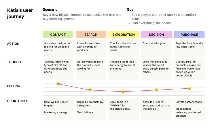

Main Opportunities:
-
Allow users to customize and exchange bike parts.
-
Highlight product reviews and ratings.
-
Provide informative product videos.
-
Allow users to reserve a bike in-store and finish the purchase in person.
4. Feature prioritization
Insights were organized into a 2x2 Matrix (Impact vs. Effort) to define priority features for the business and the user. Priority was given to high-impact, low-effort features.

Matrix 2x2
5. Designing the solution

Sketches were created to generate initial ideas. Low-fidelity wireframes were then built using Marvel. Later, high-fidelity prototypes were developed in Figma.
Sketches

Wireframes from Marvel
5.1 Usability testing
Usability testing was conducted with 4 users via the Lookback platform to understand how they would interact with the site. The objectives were to validate the interface's usability through task analysis and to gather user feedback.
While thinking aloud and explaining their actions, the users performed the following tasks:
1. Search for the bicycle and customize it on the product page.
2. Add the bicycle to the shopping cart, add another product on the cart page, and click the button to proceed to checkout.

Screenshots of user tests
The test results highlighted areas to maintain and others to improve. It was necessary to:
-
-
Make the customization panel on the product page more visible without requiring the user to scroll
-
Separate the tabs containing customization options from the summary/final result area within the product page's customization panel
-
Make cross-sell options in the shopping cart more visible without requiring the user to scroll
5.2 High-Fidelity prototype
Finalized in Figma incorporating testing feedback.

6. Final thoughts
This first UX/UI project was a journey filled with significant challenges but also immense learning; it allowed me to put into practice the knowledge I had gained over months of study.
Listening to the user was highly valuable. Discovering their preferences and concerns drove a search for solutions that would not have been found without their insights.
Let's Connect!
If you'd like to learn more about my work or chat about design, feel free to reach out.
© 2026 by Angelica Reis.